


Instagram Revamps Its Wordmark, Facing Backlash from Users
The CSR Journal Magazine

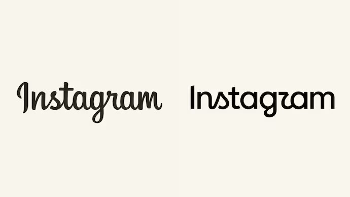
Instagram has initiated a major update to its brand identity by unveiling a new wordmark. This change marks one of the most significant alterations to the platform’s visual representation in nearly ten years. Adam Mosseri, CEO of Instagram, described the updated wordmark as a “more modern” alternative to the previous design that had been in use since 2016. The intention behind this redesign is to provide a fresher and visually appealing identity for the app.

Public Reaction and the Gen Z Blame Game

As users of the platform began to react, a number of them have attributed the decision to modify the wordmark to the younger generation, particularly Gen Z. Some users on X claimed that the new design was necessitated by Gen Z’s unfamiliarity with cursive writing. An individual commented that the shift may be related to the discontinuation of cursive instruction in schools roughly a decade ago, suggesting it could explain their inability to comprehend the old font style.

This sentiment reflects a broader discussion regarding education systems in various countries. While cursive handwriting remains part of the curriculum in India, its status has changed dramatically in the United States. According to the Common Core policy implemented in 2010, cursive was not mandated while digital typing was emphasised. Consequently, a study by Docusign found that only 51 per cent of Gen Z in the US could sign their name in cursive, a stark contrast to 80 per cent of the Baby Boomer generation who still possess this skill.

Conversations around the topic highlighted a generational divide, with some users expressing incredulity at how cursive writing has evolved into a cultural relic. One user commented on social media that cursive, once considered basic literacy, has become akin to a “secret code” for many young people today.

Potential Confusion with the New Design

In addition to the generational debate, several users have expressed confusion regarding the revised wordmark. The new design employs variations in font that have caused some to misinterpret letters. Specifically, observers noted that the letter “r” can be mistaken for a “z” in the new design. One user humorously remarked that the name “Instagram” might now be read as “Instagzam,” suggesting a connection to skincare products rather than a social media platform.

These reactions have added an additional layer to the conversation surrounding the redesign. The last major change to Instagram’s logo involved a shift from a 3D camera icon to a more minimalist rainbow design, which remains in use today. Users’ mixed feelings towards the new wordmark echo a similar sentiment shared during past branding changes.

The backlash highlights the challenges that come with a brand refreshing its image, especially when catering to a diverse user base. Instagram’s approach—balancing modern design with recognisability—will continue to be a focal point of discussion as users adjust to the new aesthetic.

Long or Short, get news the way you like. No ads. No redirections. Download Newspin and Stay Alert, The CSR Journal Mobile app, for fast, crisp, clean updates!

App Store –  https://apps.apple.com/in/app/newspin/id6746449540 

Google Play Store – https://play.google.com/store/apps/details?id=com.inventifweb.newspin&pcampaignid=web_share

Latest News

Popular Videos
